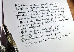
Click on the photos to view them in full size.
My friend and blog colleague Julie at Peacable Writer asked me about the writing
properties of the Pelikan M205 Duo with a BB nib; how wide this BB was. Since preferences vary I decided that the best way of showing its nib width was to make a little comparison and I thought I might as well compare all currently inked italics, broads and stubs. Reference point is the Monterosa M – which I consider is as a good example of a mainstream western M – even 50 or so years after it been manufactured. For fast scribbling and note taking I usually prefer extra fine or fine nibs. They offer a little resistance which is good when one wants to cram in as much info as possible in small writing in a small space on the paper. Good Fs and EFs fulfil all prerequisites for very fast writing – smooth, luscious (but not too wet) with good flow so that the pen doesn’t skip even with very fast writing – and still with a tiny bit of resistance which prevents the pen from slipping around. Maybe one could say that EFs and Fs are like studded winter tyres (without being scratchy) for the fast writer. They make it possible to write very fast even on very smooth paper without losing the grip in the curves (ABS breaks, ESP and manual gear is also needed when driving if one wants to keep the speed up on a slippery surface). Thus: the EFs and Fs are (for me) invaluable for efficient and functional everyday writing. The text also dries comparably fast, which is good when highlighting and jotting notes since it doesn’t smear. Good, reliable, multi-purpose nibs. But, to get to the real pleasure (both tactile and aesthetic) of writing I want to use flex, italics, stubs or obliques. Rounded Ms and broader makes my writing totally out of control and is not really an option. Maybe the flexy nibs are the quintessence of writing pleasure, but they are (for my kind of writing) not nibs that I can use efficiently for note taking and jotting since their drying time usually is rather long (and that is why inks are so beautiful in them). If I want to combine efficiency and pleasure the narrow italics, stubs and obliques is a very good option. They are usable for notes that doesn’t require that one is economic with space, journalling and makes for quite nice letters. Eye pleasing and function in one. I’ve already written about the properties of my italic nibs here and will try to not repeat myself. I think crisp italics write beautifully, but I seldom have the patience to sit down and write so slowly as they require (like the 1.9 Lamy and the 2.7 Rotring above). On the other hand they are great highlighters – if one likes highlighters that are broad and covers every single part of the letters thoroughly. The odd one out in this collection is thus the Pelikan M 205. It has a round (but with a little hint of stub) nib that is labelled BB, but it isn’t extremely broad (as you can see above) – it is closest to the Lamy 1.1 and the Monterosa (!) in width, but gives fatter lines horisontally than the 1.1. So, it is (for my needs) too round to write more than a few jots with and too narrow to function as the kind of highlighter I prefer. I still use it almost every day since the nib is soooo smooth. Thus it is an exclusion from my normal requirements. I find it quite liberating that even such small and unimportant things as fountain pen rules that oneself has made have exceptions. Always looking for loopholes.


Pingback: Link Love | The Well-Appointed Desk
Pingback: Link Love |
Wonderful comparison that gives you a real feel for the nibs.
Thank you TAO and Julie. Happy that my fast scribbled comparison was helpful!
Thank you! This is quite helpful. Your photos of your handwriting examples are so gorgeous. I’ll be back several times to re-read and take this all in. Appreciate your going into such grand detail, my dear.
Pingback: Tweets that mention width matters – efficiency vs pleasure | lady dandelion -- Topsy.com