This is not a review. I got this little diminutive (10.5 cm uncapped, 11.5 cm capped and 14 cm posted) Lalex 1938 in the mail yesterday and shouldn’t write about it at all – what can I give more than a few first impressions? But since it was a happy little surprise with some eye candy potential, I took some photos and this post is an excuse to publish them. It was a nice bargain; £25 (around $40) instead of £100. The sale have been on for quite some time and now when I ordered a nib that I need (also a bargain – 50% discount) I couldn’t resist adding the Lalex 1938 Forme.
The brand was discontinued earlier this year and was a part of the Italian Aquila firm that managed several Italian pen brands. I’ve not found much information about it and was curious of this quite anonymous brand that has not been talked about much among the pen crowd. I’ve only found one single review of a Lalex pen at the FPN (featuring the Forme) and even if it was quite positive I didn’t really know what to expect.
The Forme comes in three versions: the square, the circle and the triangle. Since I’ve never had a triangle-shaped fountain pen I went for a triangle and I don’t regret it.The triangular shape makes it sleek, but my pictures don’t manage to capture the triangular sleek elegance of it.
There were a few colours to choose between – black, brown, pink and orange – beside the blue, but this pearly, smoky, foggy, swirly blue is real nice and goes well with this elegant style. The design is not very original, but it is well performed and the manufacturer has thankfully resisted from adding tacky bling to try to make it look more expensive (cheap in my eyes). I like it.
The nib is a rather conventional stainless steel nib with the Lalex scales inscribed. It is a quite ordinary, standard steel nib without much of personality and feel. It’s does what it is set to do.
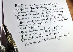
Small. It wrote surprisingly smooth out of the box. Not a nib with personality, but seems like a reliable jotter. Click on pic to enlarge it.
The ink (I’ve only used Diamine Royal Blue so far) flows well without hesitations, but it is too early to give a final verdict. A nice surprise for me, who likes finer lines when I’m jotting down notes, is that its medium-sized nib lays down a quite narrow line – in the samples above you can see that is about, or almost, as narrow as the extra fine nib on the TWSBI. Not as narrow as a Japanese fine, but like a western fine.
A regular converter cannot be used, but Monteverde's simple converter fits neatly into the Lalex Forme.
It fills via cartridges and is too short to accept standard converters, but a small Monteverde converter as above did the trick and fit the pen perfectly, which makes the use so much more fun.
A detail that I find practical is that you – since it is so short one needs to post it – screw on the cap onto the barrel to post it – it makes it post very securely. A detail that I¨m not too fond of is that the gripping section is a bit slippery. I don’t think that this is a pen for long writing sessions – rather one for scribbling down this and that here and there.
In all: I’m positively surprised by this nice little pen. I would not have paid full list price (which was around £100/$180 according to a couple of online stores that still seem to have it in stock) for it, but for this low price it is a little pearly, shiny bargain. I will follow up my initial impressions down the road when I’ve used it more.


I now have 3 Lalex Forme 1938 pens. I have the dark blue one and recently aquired the black (which has a wonderful marble grey effect) and the brown. They are fabulous pens to write with as a writer is what I am. I have just bought also the Lalex 1938 Sorrento which is ceramic with a blue laquer finish. The extra ceramic weight gives it a distinct balance and I love this as well. So along with my Aurora Ipsilon it is Italian pens all the way.
I use Private Reserve Velvet Black in the Lalex 1938 Forme which flows superbly and is a real black as I find that Visconti while a good ink is a little soft on the grey side. As a wrriter I only use black and red ink and I have tried quite a few. I use Aurora Black in the Aurora Ipsilon and am awaiting this week the arrival of Montegrappa Black to try out. When it comes to Red I now only use Private Reserve’s Dakota Red which is stunningly bright.
I wasn’t too thrilled with mine. It’s a very dry writer, and I don’t like the big difference between barrel and nib unit. (I have the round version.) Hopefully this is just a lemon and everyone else finds better flow with theirs. But, nothing against Italian pens – I have a handful of wonderful Italian fountain pens…
Pingback: A Few Random Morning Links … | The Pretense of Knowledge
eye candy indeed! this is a beautiful pen, and having a legal background, I really like the detail of the scales on the cap. this is the first I have heard of Lalex, but I will be conducting a google search about this pen tonight! thanks for the first impression review!
I’m also in the legal field and thought the scales fit me well. :)