The cap is covered in real, red lacquer – that according to penandco is applied by hand. I was lucky and managed to open and close it without cracking all the lovely red lacquer.
Click on photos to view them in a bigger size.
J Herbin was founded in 1670 – 119 years before the French Revolution! – and started out as wax seal manufacturers and didn’t start to make ink until 1700, so the ink division is merely 310 years old…old enough to be the oldest, still kicking, ink manufacturer in the world.
The colour of this ink is “hematite rouge” – iron oxide red – a colour that Herbin chose since it remind of traditional wax lacquer, which it indeed does. A bold, warm, vibrant red with orange hues. It manages to be a warm, earthy red without brown hues. Vibrant and earthy in one. I love this colour. It both reminds me of the iron oxide paint traditionally used to paint cottages with here and of red granite. It is like a warm blanket to wrap around oneself if it is cold.
Beside the lovely, original colour it has the traditional pleasant Herbin properties. The flow is excellent, the lubrication good and it seems well-behaved in the pens I’ve used it in. It is almost feathering proof. No feathering in broad nibs on cheap paper, which ought to be considered as good. Bleed through with broad nib on cheap paper is minor and no problem. Almost no bleed through at all on Leuchtturm 1917, Canson 1557 or Rhodia web note book.
It shades well – even in extra fine nibs. The only big drawback is the long drying time, which probably is due to its high saturation. I don’t see it as something that will make me use it less, but it might be interesting to know.
I really love this warm, vibrant red and hope Herbin will transfer it into their regular production – it is too beautiful to be a limited edition!
If you want to read more about it you find reviews of the 1670 anniversary ink at Inkophile and Biffybeans
More info about J Herbin is found on their website.
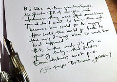
Here are some other writing samples in natural light since this ink is a chameleon and quite hard to capture – as inkophile mentioned in her review. Click to view in a bigger size.
Below: iron oxide in another setting – Swedish traditional red iron oxide paint. Good for the wood, beautiful and brightens up the country side during the winter.


Pingback: J. Herbin 1670 Ink | Strange Journals
Pingback: J. Herbin 1670 Anniversary Ink (Rouge Hematite) « Pens'n'Paper
Pingback: end-of-the-year-lists | lady dandelion
Pingback: j. herbin anniversary ink — gogirl cafe
I love the ink – I’ve just ordered it and hope to have it early next week. If anybody is interested in samples, visit my blog for details: http://inksample.blogspot.com/
How did you manage to get the lid off without cracking the lacquer? Just unscrewing it the usual way carefully? Thanks!
I was careful and I guess I was a bit lucky and it has remained uncracked – and I’ve opened and closed it a few times now.
Thanks for the review – again, you have such lovely pictures. I’m very enticed by the ink. Hope they start to make it regularly, as I certainly won’t have a chance to get a limited edition bottle.
I love reading andlooking at your reviews! This ink looks a fabulous colour. Red is one of my favourite ink colours. I am going to get some after next pay day, I hope. Keep on writing.
Lesley
Thank you all for enthusiastic feedback!
TAO, this isn’t a correctional red type of ink – rather a warm red that actually can be used to write letters with :)
FANTASTIC! ;-)
I think it’s a great looking red. Nice samples and photos (as usual). I don’t actually use red ink a great deal since it always reminds me of having my papers graded and corrected in school. :D I may give this one a try since it is quite attractive.
Pingback: J. Herbin 1670, Edition Anniversaire « An Inkophile’s Blog
Nice review! I like the comparison to the paint colour :D I hope they will put it into regular production too. It’s so nice. I hope I will get the chance to try some.
Also I like the branches of catkins in the last photo.