

I’ve been an enthusiastic user of the QV Habana ever since a kind friend in the US gifted me one. I’ve particularly fancied the smooth, white, paper and its fountain pen friendly properties. I usually use the big sized Habana as a personal journal – the size is perfect – big enough to store A5 sheets, post cards, letters and other stuff. Before using a pocket sized Leuchtturm 1917 as a travel journal I hadn’t really used these small, pocket sized, journals, but that positive experience made me see that this smaller format has its use. It’s very convenient when you’re on the go and want to jot down things in haste.
This little comparison could happen because a generous US friend gave me a pocket sized Habana – the old version – since she wanted to make sure that I’d have one of the old versions and because Karen Doherty at Exaclair kindly sent me one of the new – widely discussed – Habanas. Thank you both so much!
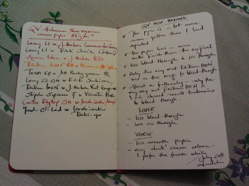
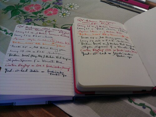
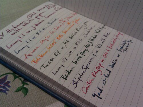
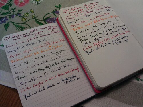
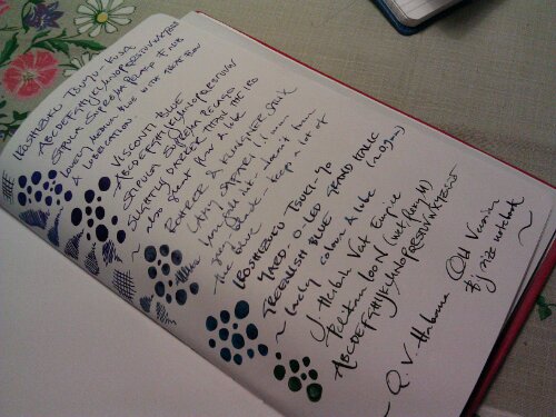
I’ll start with saying, straightaway, that the new Habana isn’t a bad notebook. The “only” thing that has changed is the paper – and the quality is still very good, but it is different. I’m usually quite open for changes, but in this particular case the change isn’t for the better. Yes, the paper is still of very good quality. It doesn’t bleed through more (actually less if you look at the pictures below), it doesn’t feather more. It is still a very fountain-pen-friendly paper. But it is more matte – not the same silky, smooth, surface – and it is very cream coloured. Exaclair call it ivory, but I’d almost say that it leans more towards a creamy light yellow than to white. Had it been more of an ivory/eggshell/offwhite white it had been quite OK, but this makes the writing experience for someone (like me), who are fond of her different ink colours and comparing them and seeing them on paper, a bit thwarted and less fun.
Whether one prefers a matte/silky and/or creamy/white paper is – most certainly – a highly personal matter, but for me the new paper in the Habana is a downgrade. It is a pity that it couldn’t come in two versions – one with creamy paper and one with white paper. The Habana was quite unique, with its silky, white paper, compared to the other similar notebooks on the market and I think it is a pity that there aren’t any such notebooks (with the same paper quality and overall characteristics) around anymore. This change makes me less inclined to buy a Habana since it has lost its special features. I thus hope Exaclair will come around and provide the Habana with white, silky paper as well as with ivory, matte paper. I think there is a market for both.
PS This post is also an experiment posting from my phone. The photos are SOOC, shot with and uploaded from phone and the review is also written on my phone. If you have any input on the quality on the post – photo quality etc – please make a comment! It would be most helpful.


Pingback: Ivory Habanas: Reviewers speak « Quo Vadis Blog
Glad to hear the photos will be linked – your usual review style with linked photos is much more useful and i tend to clcik on all the photos to get a better look. How do you manage to work on a phone posting so much info???? I can barely write 3 lines of a text without major spelling mistakes!
I have to say I competely agree with you and find it odd that the white paaper was scrapped rathert ahn offering both
I believe the paper they used previously was Claire Fontaine. I know you couldn’t get the QV Habana journals with the CF paper only in some regions. I bought one a couple years back, and haven’t gotten around to using it, but it did not have the ‘Paper made in France’ marking on the paper label wrapped around the book, so it was the alternate paper. I haven’t payed much attention to the recent discussions, but am assuming they have stopped using CF paper in them altogher.
No, the paper is still ClaireFontaine.
Pingback: Friday review roundup « Quo Vadis Blog
Pingback: Tuesday Grab Bag of Links … | The Pretense of Knowledge
One of the aspects of your posts and photos is always the rich and lavish photos you attach. I have to think it is related to your posting by phone, but the pictures in this most recent post cannot be clicked to enlarge. I love to examine your writing, so this time was a slight disappointment.
Appreciate your testing and comments on the new vs old Habana notebooks.
Thank you for providing feedback on the photos. I’ll check the settings in the phone app. I’ll probably not do much of posting from phone, but I wanted to check if it was possible to do a “serious” blog post fully from phone. I agree that it is disappointing when these kinds of photos isn’t clickable. Thanks again for taking time to write constructive and very usable feedback!
I’ve now checked and changed the settings – next phone post will have properly linked photos. :)