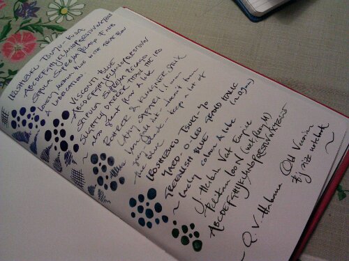
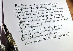
highlights in yellow and orange

Before going into reading lots and lots of legal texts – complicated, stiff and crammed with words carrying specific meanings (where it makes a world of difference if it is a may or might) I had a snooty attitude towards highlighters and it was very reluctantly that I admitted that highlighters made my studies easier. But even so I never took them to heart since I never really got rid of the feeling that the fluorescent highlighter colours hit me in the face (I know they come in purple and blue and green – but I never liked them since they were too dark) and almost overshadowed the highlighted text. When I got back into fountain pens some years ago I was happy to realize that a broad italic nib and a yellow ink may be the highlighter I’ve been looking for. I got myself a 1.9 mm italic Lamy Vista (now sadly misplaced) and Diamine Sunshine Yellow and Rohrer & Klingner Helianthus (Sunflower) and it was instant love. Warm yellow ink – providing highlight without slapping me in the face and still managing to highlight. Perfect. Ever since I’ve basically been loyal to R&K Helianthus and Diamine Sunshine Yellow (they are very similar) as my highlighter inks with a few ventures to other inks. What I still – after using it practically everyday for a few years – like with the Sunshine Yellow is that it is a full-bodied yellow with reddish hues – not an orange. It shades in a delightful way and still manages to brighten my mood.


Some might find the Sunshine Yellow/Helianthus too dark to be a good highlighter and then (if you don’t prefer the fluorescent inks) the Diamine Yellow might be useful. If you’re into flourescents Noodler’s have a range of those and both Private Reserve and Pelikan has at least one  bright, fluorescent yellow highlighter ink respectively.  The Delta Orange (and also Diamine Orange) are also very well suited for highlighting. The Iroshizuku Fuyu-Gaki is a tad too dark if the nib isn’t a very broad and not too wet italic. It worked quite good in the Rotring Artpen, but the dryness made it lose a lot of its brightness and spark, which, since it has a big price tag, felt like a lose-lose. I m0stly chose it as a comparison – it is so very beautiful in a rather wet nib.

I know there have been some questions about whether fountain pen inks are too wet and smeary to use as highlighter inks, but I haven’t had any problems with that. Much of the text I highlight is text that I’ve printed with my printer using ink cartridges (as below) and I haven’t experienced smearing.

Here are some other blog posts on using regular fountain pen ink as highlighters:

Rhodia Drive Highlighting with Herbin

Shopwritersbloc Using J Herbin Inks as Highligher Inks

Posted in delta, diamine, fountain pens, habana, inks, iroshizuku, lamy, paper, pelikan, pens, reviews, rohrer & klingner, writing | Tagged , , , , , , , , , , , , | 9 Comments

quo vadis habana – the new vs the old

image

I’ve been an enthusiastic user of the QV Habana ever since a kind friend in the US gifted me one. I’ve particularly fancied the smooth, white, paper and its fountain pen friendly properties. I usually use the big sized Habana as a personal journal – the size is perfect – big enough to store A5 sheets, post cards, letters and other stuff. Before using a pocket sized Leuchtturm 1917 as a travel journal I hadn’t really used these small, pocket sized, journals, but that positive experience made me see that this smaller format has its use. It’s very convenient when you’re on the go and want to jot down things in haste.

This little comparison could happen because a generous US friend gave me a pocket sized Habana – the old version – since she wanted to make sure that I’d have one of the old versions and because Karen Doherty at Exaclair kindly sent me one of the new – widely discussed – Habanas. Thank you both so much!

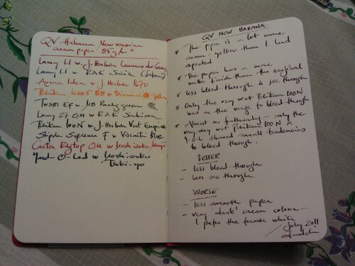
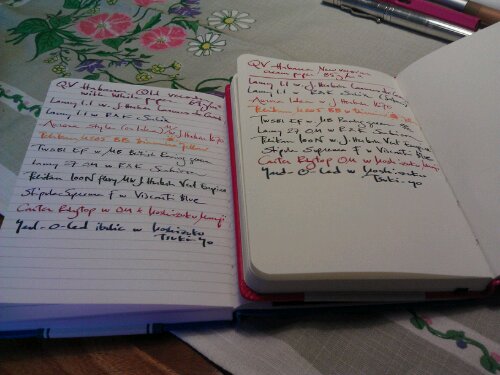
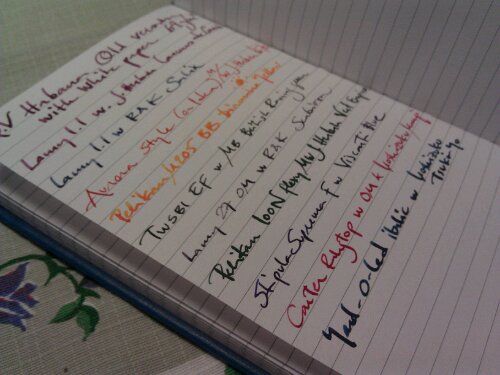
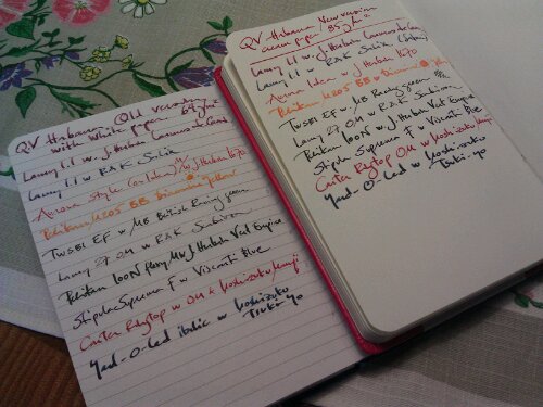
I’ll start with saying, straightaway, that the new Habana isn’t a bad notebook. The “only” thing that has changed is the paper – and the quality is still very good, but it is different. I’m usually quite open for changes, but in this particular case the change isn’t for the better. Yes, the paper is still of very good quality. It doesn’t bleed through more (actually less if you look at the pictures below), it doesn’t feather more. It is still a very fountain-pen-friendly paper. But it is more matte – not the same silky, smooth, surface – and it is very cream coloured.  Exaclair call it ivory, but I’d almost say that it leans more towards a creamy light yellow than to white. Had it been more of an ivory/eggshell/offwhite white it had been quite OK, but this makes the writing experience for someone (like me), who are fond of her different ink colours and comparing them and seeing them on paper, a bit thwarted and less fun.

Whether one prefers a matte/silky and/or creamy/white paper  is – most certainly – a highly personal matter, but for me the new paper in the Habana is a downgrade. It is a pity that it couldn’t come in two versions – one with creamy paper and one with white paper.  The Habana was quite unique, with its silky, white paper, compared to the other similar notebooks on the market and I think it is a pity that there aren’t any such notebooks (with the same paper quality and overall characteristics) around anymore. This change makes me less inclined to buy a Habana since it has lost its special features. I thus hope Exaclair will come around and provide the Habana with white, silky paper as well as with ivory, matte paper. I think there is a market for both.

PS This post is also an experiment posting from my phone. The photos are SOOC, shot with and uploaded from phone and the review is also written on my phone. If you have any input on the quality on the post – photo quality etc – please make a comment! It would be most helpful.

image

image

image

image

image

image

image


Posted in aurora, diamine, fountain pens, habana, inks, iroshizuku, j herbin, lamy, montblanc, note book, paper, pelikan, pens, reviews, rohrer & klingner, stipula, twsbi, visconti, yard o led | Tagged , , , , , , , , , , , , , | 9 Comments