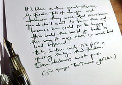
When I write letters I often I use good quality sketch or drawing paper instead of using (expensive) stationery of varying quality. I grew so tired of finding that price and quality does not necessarily correspond when it comes to stationary and that it seldom is fountain pen friendly. At the same time I find it a little boring to write on copy paper. Less expensive and almost always well worth the price (compared to regular pads). One of my latest findings is the Canson 1557 sketch pad with 120 g/m2 paper. It is a thick (but not too thick to be used as stationery) white paper with a smooth and pleasant texture and one of the most fountain pen friendly paper qualities I’ve tried. It defeats even a very stubborn featherer as Diamine Royal Blue – which feathers on most papers that otherwise are considered fountain pen friendly. I got so inspired by doodling on this new sketch pad that I made an instant ink test on it. All inks and pens (a wide variety) got on very well with the paper and I thought I’d might as well post the result. It was made in haste, but might give a feel of the paper and – of course – the ten Diamine shades of blue, violet, purple, and teal. It seems like it is almost impossible to capture the Imperial Blue and Sapphire Blue, but they are rather true to how they look in real life. The registrar’s ink is much more alive with a lot of beautiful shading than in the sample, but I think that this quick sample shows a fair picture of how they compare to each other. Click on the sample to view it in full size.
Inks sampled – all of them Diamine: Registrar’s (iron gall), Majestic, , Amazing Amethyst, Imperial Purple, Royal Blue, Steel Blue, Imperial Blue, Sapphire Blue, Preussian Blue, Teal. A very good comparison of the new Diamine colours Amethyst, Lavender and Marine (with Steel blue as reference can be found at FPN here. My favourites of the inks tested are: Majestic, Amethyst, Imperial Purple, Royal Blue and Steel Blue. The heavy majority of inks from Diamine in my ink stable is due to the simple fact that they are good, cheap (even shipped), comes in handy plastic 30 ml bottles (if you buy directly from Diamine). If you buy straight from them you also get a free carton with 18 (!) international standard cartridges if you buy three small bottles of ink… I have no other affiliation with them more than being a very satisfied customer.


I love the teal ink. It’s gorgeous.
Great overview of range of blues…
Prussian Blue is one of my favs along with JHerbin’s Bleu Nuit…use both most often of various inks…
Would like to try some of the other Diamine blues you show; Majestic Blue, Royal Blue, Imperial Blue along with another one think called Presidential Blue…
Lovely colors. I, too, have been on a search for that perfect blue. Ryan sent me 15 samples and I’m still confused. Love the Majextic Blue, Steel Blue, Teal and Sapphire Blue. May have to buy all of those. I also loveo Noodlers Le Colour Royale for a purple-blue that is so pretty. Thanks for the fun review.