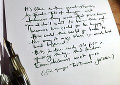
Simple, refined beauty from the time fountain pens were cherished tools. Very few adornments – just exquisite shape, materials and attention to function. Both come from, roughly, the same era and were probably made in the mid-1940s and came to me used, which in itself intrigues the mind. What had they been up to before ending up with me? What could they write about themselves if they could? What parts of the European history of the 20th century have they written a part of? I’ll never know, but I do know they’ll continue to write a part of my life.
Click on images to view them in a bigger size and/or open the slide show.


Your gorgeous handwriting in vintage colour ink really does justice to these stunning pens, thanks for the post
Thank you! :D
These two gentlemen are very well preserved. Congratulations. I like those 13x Montblancs so very much. And the 100N is a delightful little pen. Mine’s the same colours but the pattern is totally different. =)
Cheers,
Peter
I forgot to ask: are those LP sleeves you used as a background? They are very fitting.
Yes they are very nice – both the MB 13x series and the Pelikan 100 & 101. I like that even the flagship models back then weren’t big, overly ornamented bats, but made in handy sizes to be written with. :-) Thanks for positive response – it’s much appreciated. :-)
No, it’s actually old wall calendars that I found to pretty to throw away and converted to envelopes, but the calendar used old opera posters, so your guess was within the right area. :-)
Sorry for not writing individual responses – I did that first, but they vanished when I had to edit the post – very strange. I made an experiment and blogged via the WordPress app on my tab and realized this afternoon that it compressed the images in a way that comprised the quality a bit too much, so I reuploaded all pics and put them in a tile gallery – easier to get an overview and possible to click on the images and see them in a decent size.
Thank you all so much for taking the time to write such nice responses to my blog post – I really appreciate it. Happy you like my handwriting – flexy nibs flatter my speedy handwriting.
Great photos for such amazing subjects :)
I envy your handwriting, it’s so clean yet elegant!
Beautiful pens and I love J. Herbin inks and am a great fan of Larmes De Cassis and the Vert Empire has that long lost ages ago feel about it. A perfect match of inks for your vintage pens.
Sigh. Lovely, beautiful pen porn. Thank you for sharing! I love your writing!
Great old pens, pics, and writing!
Thanks for sharing.
Mark
What grand old gentlemen! I wish I could use a flexy nib and write like that :)