
Intro to reviews revisited
I’ve, as mentioned before, thought about doing this for a while. Even if one is thorough and use the pen/ink/paper a lot before writing a review, some features/thoughts/experiences doesn’t show before one has used the item for quite some time. One can always edit the original post, but on the other hand I think it is a point with a separate post that one can compare with the original. So, this is first episode of reviews revisited. I’ll post these revisits on a regular basis and I’d be very happy to receive feedback on if you think that this “review revisited” has been a useful read and if you have ideas about what I could think about when doing this next time. I’ll not limit this to pens – I’ll do this with inks – and maybe paper – as well. First out is my Pilot M90 – a pen I fell in love with at first sight.

The Pilot M90 revisited
You find the original review of the M90 here. I chose the M90 because it was one of the very pens that reignited my passion for fountain pens. It took me a while before I finally got it, and since I was so enthusiastic about it when I wrote the first review I felt that a revisit, after almost a year of use, would be a good idea.
 “The M90 is for me an icon of the perfect shape and simple perfection. A stylized, simplified modern quill. Modernism and classicism united. I thought it was divine when I first saw it and I still – with it in my hand, using it – think it is.”
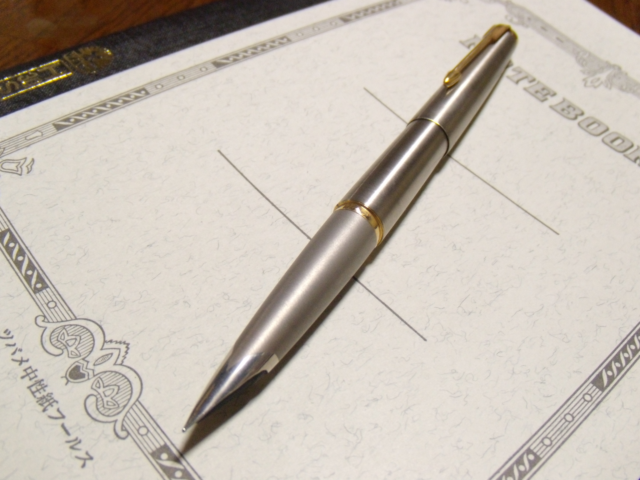
I still find this very unique and timeless and am mesmerized by the shape. Some people has mentioned that it is quite similar to the Parker 50 (see photos here and here) and that the M90 isn’t that unique or original. Since they were both originally designed during the 1960’s (see an extensive article on the original MYU701/Murex here) they share some of the futuristic, streamlined, rocket design features – which can also be found in Lamy 27 and Montblanc 22. But I must say that even if they share some characteristics – integrated nib, brushed steel (the P 50 came in many other versions as well) I think there is more that separates the M90 from the Parker 50 than unites. The M90 is a short pocket pen which get full size when posted (a very clever feature) and it has a wholly different feel compared to the Parker 50 – or any other pen. (I’d love to have a Parker 50 – not as copy or substitute for the M90, but as a pen in its own right – it is a cool pen – especially the ones without gold details.) It is the perfected, modern quill with a very special form feel to it that I have yet to see in another pen. Absolutely nothing unnecessary. Aesthetic minimalistic perfection combined with function. I know that the strict MYU701/Murex fans often claims the discreet blue stone to be blingy, but I can live with that. I’ve not ceased to be mesmerized by the design. It is a one-of-a-kind pen.

“This is an extremely well built pen. Everything from the snap-on-cap with the clever cap ring that holds the cap in place, both posted and capped, is top notch. The clip is beautifully streamlined and functions well. It surprised me – as others also have mentioned – that the gripping section is so non-slippery. It has a nice weight to it (27g~1 oz) and is well balanced when posted. “
After almost a year of extensive use the M90 shows no signs of fatigue. The only thing I have noted quality wise is that it is quite easily scratched. It shows scratch signs on the barrel near the cap ring – small scratches that originates from posting. I don’t mind these signs of use, but it is worth to mention that the mandatory posting also scratches the pen. I’ve also somewhat reconsidered the non-slippery stand point. It is a little slippery when it comes to extensive use. I also find that the “section” is a little uncomfortable for long, concentrated writing sessions. But its format makes it into a very good pen for note taking and to carry with oneself. It holds up quality wise even if I have made some reconsiderations regarding its suitability for longer writing sessions. It is perfect for writing on the move.

“This is a fine, integrated nib in stainless steel. I’ve read that some people aren’t that impressed with this nib, but I am. It is smooth, without being slippery and uncontrollable – thus designed for fast, fine-nib-writing, which suits me perfectly. It is quite stiff, but not a numb nail, which also suits my writing style splendidly. It lays down an even, medium wet line and seems to enjoy various inks.”
I’m still very fond of the nib. I’ve read that there has been problems with leaking nibs, scratchy nibs and bad flow, but I haven’t had any problems during the time I’ve had it. I’ve used a lot of different inks and papers and haven’t experienced any problems with regards to nib and feed – quite the contrary. This has been one of the least fussy nibs I’ve used. Its preciseness and excellent flow contributes to its status as superior-on-the-move-pen.
“I’m very happy that I got this pen at last. I will not sell it. This is an absolute keeper. I love this pen. End of story.”
Still true. The two real original features are the perfected shape and design and the clever pocket feature. I have pens that are more pleasant and fun for longer writing sessions, but this still has its own place and I can’t imagine selling it.

You also find additional photos of it in the winter frost here. My original posting at FPN with a lot of comments and additional information can be found here.


